Colour is a powerful visual tool that can enhance the appeal and readability of your Power BI reports. Using effective colour schemes and principles like the 60-30-10 rule, you can create eye-catching and impactful visual reports.
Introduction to Colour Schemes
Colour schemes offer a structured way to combine colours, ensuring your designs are harmonious and balanced. By mastering these principles, you can craft reports that evoke the right emotions and create the desired atmosphere. This knowledge helps you make your reports not only look great but also communicate your data clearly and effectively.
The three primary colours: red, blue, and yellow are the foundation of all other colours. When you mix primary colours, you create secondary colours (orange, green, and purple). Further mixing of primary and secondary colours produces tertiary colours, such as red-orange, yellow-green, and blue-purple.
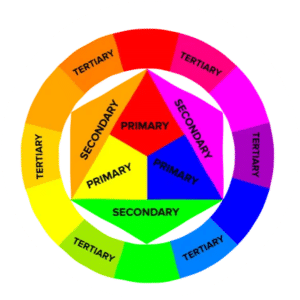
A simple diagram showing the primary colours, their combinations to form secondary colours, and further combinations to form tertiary colours.
The Colour Wheel
The colour wheel is a circular diagram of colours arranged by their chromatic relationship. It helps us understand the relationships between colours and is essential for creating balanced and harmonious colour schemes.
- Hues: Pure colours without any addition of white or black.
- Tints: Colours created by adding white to a hue.
- Tones: Colours created by adding grey (white & black) to a hue.
- Shades: Colours created by adding black to a hue.
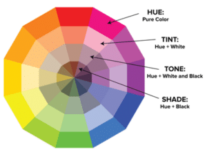
A colourful wheel with labels for hues, tints, tones, and shades.
Using the Colour Wheel to Create Colour Schemes
The colour wheel can be used to create seven main types of colour schemes. Each scheme has its unique characteristics, benefits, and disadvantages.
Monochromatic Colour Scheme
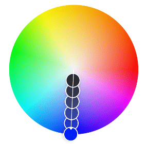
- Definition: Use a single colour with varying shades and tints.
- How to Use: Choose a base colour and then add tints, tones, and shades to create a cohesive look.
- Benefits: Creates a simple and elegant visual presentation. It’s easy to manage and ensures a harmonious look.
- Disadvantages: Can appear monotonous or flat if not enough variation in shades is used.
- When to use: This scheme is ideal for creating a serene and unified atmosphere. It evokes a sense of simplicity, professionalism, and sophistication. Use it when you want to maintain a calm and consistent visual theme throughout your reports.
- Example: Apple often uses a monochromatic scheme, particularly shades of white and grey, in their product designs and marketing materials. For example, the Apple website and product packaging feature a clean and minimalist design using varying shades of grey to highlight product details effectively.

A Power BI dashboard using various tints, tones, and shades of blue]
Complementary Colour Scheme
- Definition: Combines colours that are opposite each other on the colour wheel.
- How to Use: Select two complementary colours to create a high-contrast and dynamic look. Use one colour as the dominant hue and the other as accents.
- Benefits: Offers strong visual impact and draws immediate attention.
- Disadvantages: Can be overwhelming if not balanced properly. The high contrast may cause visual fatigue over extended viewing.
- When to use: This scheme is excellent for creating dramatic and eye-catching visuals. It evokes emotions such as excitement, energy, and vibrancy. Use it when you want to highlight specific elements or data points that need to stand out prominently.
- Example: The logo and branding of FedEx use a complementary scheme of purple and orange. The contrasting colours create a dynamic and memorable visual identity that stands out in the logistics industry.

Teal and Orange complimentary scheme is used widely in film trailer posters.
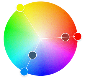
Split Complementary Colour Scheme
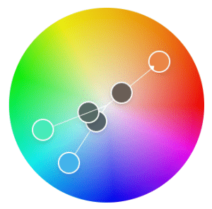
- Definition: Uses a base colour and the two adjacent colours to its complementary colour.
- How to Use: Choose a base colour and then select the two colours adjacent to its complement.
- Benefits: Provides strong visual interest without the stark contrast of complementary schemes.
- Disadvantages: Requires careful balance to avoid colours clashing or competing for attention.
- When to use: This scheme offers a balanced approach between contrast and harmony. It’s effective in creating visuals that are lively and engaging while maintaining a degree of subtlety. Use it when you want to achieve a dynamic look without overwhelming the viewer.
- Example: The logo and branding of Burger King use a split complementary scheme of red-orange, blue, and yellow-green. These colours create a harmonious yet visually stimulating design that appeals to fast-food consumers.

A Power BI dashboard utilising a split complementary colour scheme of orange with blue and green. [2]
Analogous Colour Scheme

- Definition: Uses colours that are next to each other on the colour wheel.
- How to Use: Pick one dominant colour and use its neighbours for accent and support.
- Benefits: Harmonious and pleasing to the eye.
- Disadvantages: Lack of contrast can be too subtle.
- When to use: This scheme is ideal for creating a sense of comfort, unity, and ease. It evokes emotions such as warmth, relaxation, and approachability. Use it when you want to present information in a friendly and cohesive manner, making it easy for viewers to navigate and understand.
- Example: The branding of Spotify uses an analogous scheme of green, yellow-green, and light green. These colours create a cohesive and inviting visual identity that reflects their user-friendly music streaming platform.

A Power BI report using shades of blue, blue-green, and green.
Triadic Colour Scheme
- Definition: Uses three colours that are evenly spaced around the colour wheel.
- How to Use: Select three equally spaced colours on the wheel to achieve a balanced and vibrant palette.
- Benefits: Offers a high degree of contrast and visual interest without the intensity of complementary colours.
- Disadvantages: Requires careful consideration to balance the use of three distinct colours effectively.
- When to use: This scheme is versatile and well-suited for creating lively and dynamic visuals. It evokes a sense of diversity, energy, and creativity. Use it when you want to convey a balanced yet stimulating atmosphere in your reports.
- Example: The logo and branding of Adidas use a triadic scheme of black, white, and red. These colours create a bold and energetic visual identity that resonates with their athletic and performance-driven products.
Square Colour Scheme
- Definition: Uses four colours evenly spaced around the colour wheel.
- How to Use: Select four equally spaced colours to create a palette that offers variety and visual interest.
- Benefits: Provides a rich and diverse range of colour combinations.
- Disadvantages: Can be challenging to harmonise and balance effectively.
- When to use: This scheme is suitable for projects where you want to create a vibrant and visually stimulating environment. It offers flexibility in creating complex and layered visuals. Use it when you want to showcase multiple facets or categories of information without overwhelming the viewer.
- Example: The Google logo and branding use a square colour scheme of blue, red, yellow, and green. These colours represent Google’s diverse range of products and services while maintaining a cohesive and recognisable visual identity across platforms.
Rectangle (Tetradic) Colour Scheme
- Definition: Uses two pairs of complementary colours.
- How to Use: Select two complementary pairs of colours on the colour wheel. This creates a scheme with four colours that are evenly spaced.
- Benefits: Offers rich and diverse colour combinations that provide a lot of visual interest.
- Disadvantages: Can be challenging to balance and harmonise effectively. If not managed carefully, it may appear chaotic or overwhelming.
- When to use: This scheme is ideal when you want to create a vibrant and dynamic visual impact while maintaining a sense of order. It allows for versatility in highlighting different aspects or categories within your design.
- Example: The logo and branding of Microsoft Windows use a tetradic scheme of blue, green, red, and yellow. These colours provide a diverse and visually stimulating palette that represents the diversity of their products and services across various platforms.

An app harnessing a tetradic scheme with red, green, blue, and orange.
The 60-30-10 Rule
The 60-30-10 rule was originally a decorating rule; however it can also be applied to help you put together a colour scheme easily. It states that 60% of your design should be a dominant colour, 30% should be a secondary colour, and 10% should be an accent colour. This rule ensures that your design is balanced and visually appealing.
Application Example:
- 60% Dominant Colour: Background or main area of your Power BI report.
- 30% Secondary Colour: Graphs, charts, or important data sections.
- 10% Accent Colour: Highlights, headings, or key information.

A web page which uses 60% background white colour, 30% secondary black elements, and 10% green accents.
Using Online Tools for Colour Selection
Online tools such as Adobe Color and Coolors.co, are fantastic resources for choosing the perfect colour scheme for your Power BI reports. These tools offer user-friendly interfaces and a wide range of features to help you explore various colour combinations and schemes.
Adobe Color
Adobe Color provides a comprehensive colour wheel tool where you can experiment with different hues, shades, and tones to find the ideal palette.
Coolors.co
Coolors.co is another excellent tool that generates random colour schemes or allows you to create your own. You can lock in colours you like and continue generating until you find the perfect combination.
Paletton
Paletton is similar to Adobe Color but offers more flexibility, allowing you to explore beyond the traditional 5-tone limit.
Designspiration
Designspiration is an inspiration tool where you can pick up to 5 colours and search for images matching your query. This can be a great way to find visual inspiration based on your chosen colour palette.
Summary
Choosing the correct colour scheme can significantly impact the effectiveness and attractiveness of your Power BI reports. By understanding the basics of colour theory and using the colour wheel to create well-balanced schemes, you can ensure that your reports not only communicate information effectively but also captivate your audience. Remember to apply the 60-30-10 rule to maintain harmony and balance in your design. With these tools and techniques, your Power BI reports will undoubtedly stand out and leave a lasting impression.