Artificial Intelligence in Power BI
At Telefónica Tech, we like to look forward to future trends within the technology industry. For a few years now, this has meant being aware of advances in Artificial Intelligence (AI) within the Business Intelligence (BI) landscape. Until recently, this meant skilled individuals with significant coding experience applying their skills to reporting data, but in 2020, this is no longer an expensive undertaking for the few organisations – it’s built into the entire Microsoft data platform.
Over the next few weeks, we’ll be sharing an article about each of the ways that AI is built into augmenting Power BI. This article covers AI visuals in Power BI, Part 2 of the series will be covering cognitive services in Power BI and part 3 will explore artificial intelligence in the Power BI service.
But let’s take a few steps back – what is Artificial Intelligence? According to Encyclopedia Britannica, ”The ability of a digital computer or computer-controlled robot to perform tasks commonly associated with intelligent beings.”
In short, AI can perform automated tasks that may be deemed dull, complex or time-consuming. Once automated, these tasks can be repeated on demand, improving human performance. And as we know, data is everywhere. Our businesses have too much data and not enough insight. AI can inexpensively bridge this gap.
What is Power BI?
Power BI is Microsoft’s Business Intelligence offering, currently ranked the best BI tool by Gartner. Power BI is a suite of business analytics tools used to analyse data and share insights securely.
So, what does AI mean for those businesses using or moving to Power BI as an analytics platform? It means that developers can utilise Azure services, out-of-the-box visualisations or augmented services to improve their reporting suite.
AI Visuals
Power BI now has three AI-driven visuals available for use. These three visuals utilise background processing to provide expanded analysis within the end report, removing any need for auxiliary processing. This analysis is done on the fly within the front end and needs no intervention from a developer. Let’s look at each of these visuals:
Q&A
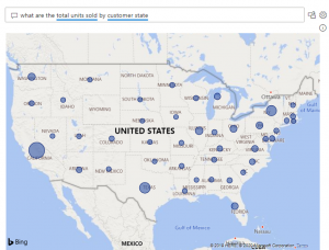
The Q&A visual uses natural language capabilities to answer questions from consumers. The answer will be based on the dataset that sits behind the report, though, this visual is incredibly empowering for non-technical consumers. As well as allowing users to ask natural questions like, “what are the total units sold by customer state?” Power BI will answer by displaying the answer in the best suited visual. In this instance, our dataset has geographical objects indicated, allowing Power BI to use further AI and assume that the best way to display the answer to this question is in a Map.
Key Influencers
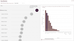
The key influencers visual uses AI to provide advanced analytics within the visual itself. By using the report dataset, a user can gain a deeper understanding of what factors are influencing an attribute. For instance, by asking Power BI to analyse what affects the family house of those who have killed other characters in Game of Thrones, by method and location, we get a breakdown of influencers. We see that the method is ‘Poison’, then the killer’s house is 14.62 times more likely to be ‘House Stark’. This offers incomparable automated analysis.
Decomposition Tree
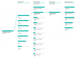
The newest AI visual in the Power BI toolkit is the Decomposition Tree. This visual is intended to deliver root cause analysis for end-users. The visual can illustrate data across multiple dimensions to interrogate the individual parts that contribute to the whole.
In the below figure, we can see the US viewership by Season > Director > Writer > Episode without there being a predefined hierarchy.
The visual can also cut the data to the ‘High’ value or ‘Low’ value, explained below:
- High Value: Considers all available fields and determines which one to drill into to get the highest value of the measure being analysed.
- Low Value: Considers all available fields and determines which one to drill into to get the lowest value of the measure being analysed.
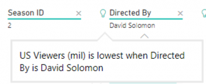
A lightbulb will show next to the attribute which has used AI splits and provides a natural language tooltip when hovered over:
As with all Power BI visuals, the decomposition tree can be used to interact with any other visuals. For instance, a bar chart of viewership by director could be used to cut down the scope of the decomposition tree.
We hope this has helped to explain how AI Visuals work and the Artificial Intelligence available in Power BI. Part 2 of the series will be covering cognitive services in Power BI and part 3 will explore artificial intelligence in the Power BI service.
If you would like to find out more about Power BI visit our Power BI page.
For more information on our AI and data science visit our Data Science page.


