Do you want to make the most out of AI to visualise your data quickly and easily from Power Apps and Dynamics 365? If so, you’ll love the new Power BI feature – “Visualise this view”.
Microsoft’s November release of model-driven apps within Dynamics 365 introduced a new feature to generate visuals of your data in just a few clicks, based on artificial intelligence (AI). These visuals help you to analyse your data more effectively and intuitively. In this blog post, I’ll show you how to use this feature and what benefits it can bring to your organisation.
Enable “Visualise this view”
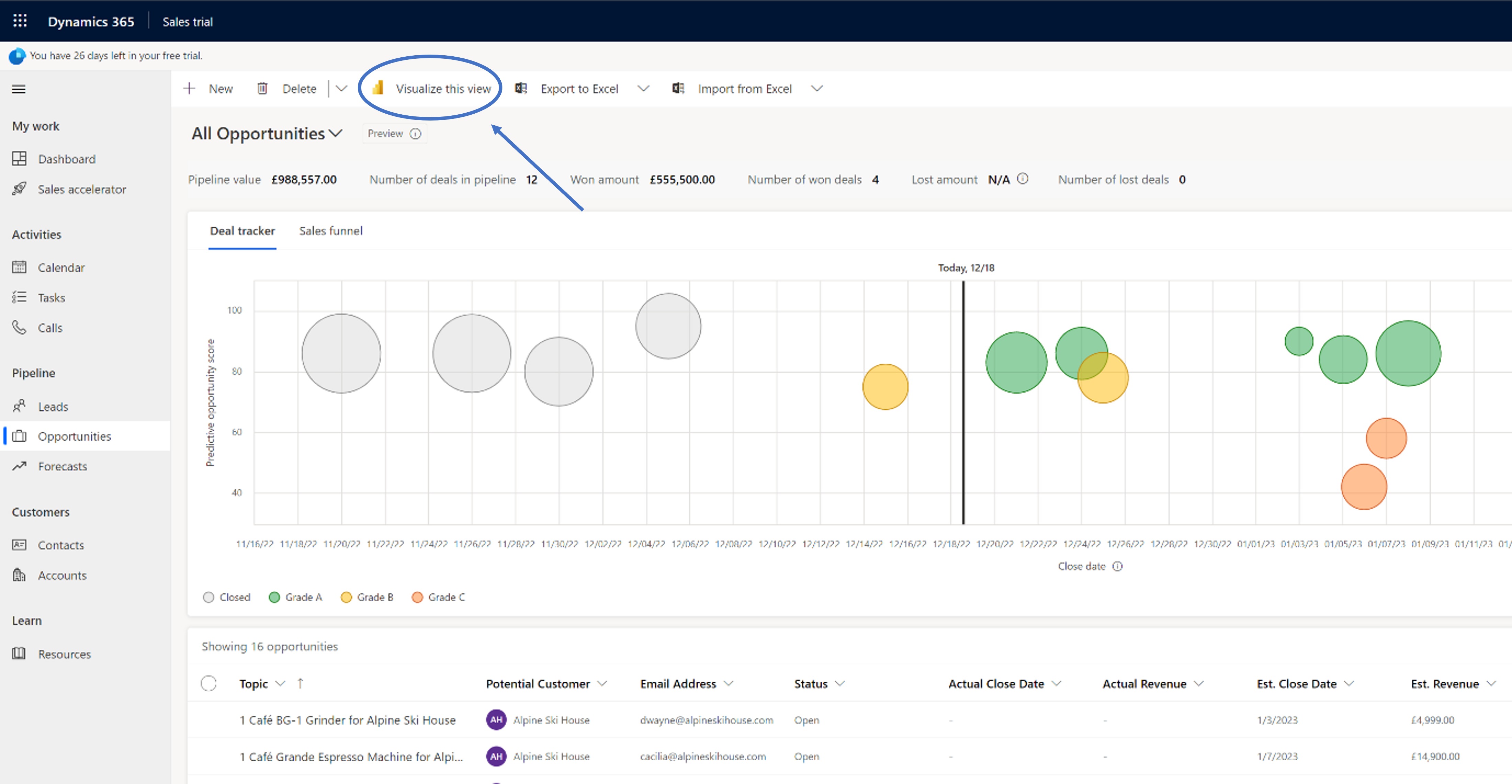
Once the system administrator enables the feature, the new button “Visualise this view” appears in the ‘views’ section for the benefit of all users.
Figure 1 – A dashboard in Dynamics 365 Sales showing the “Visualise this view” button.
Automated report creation
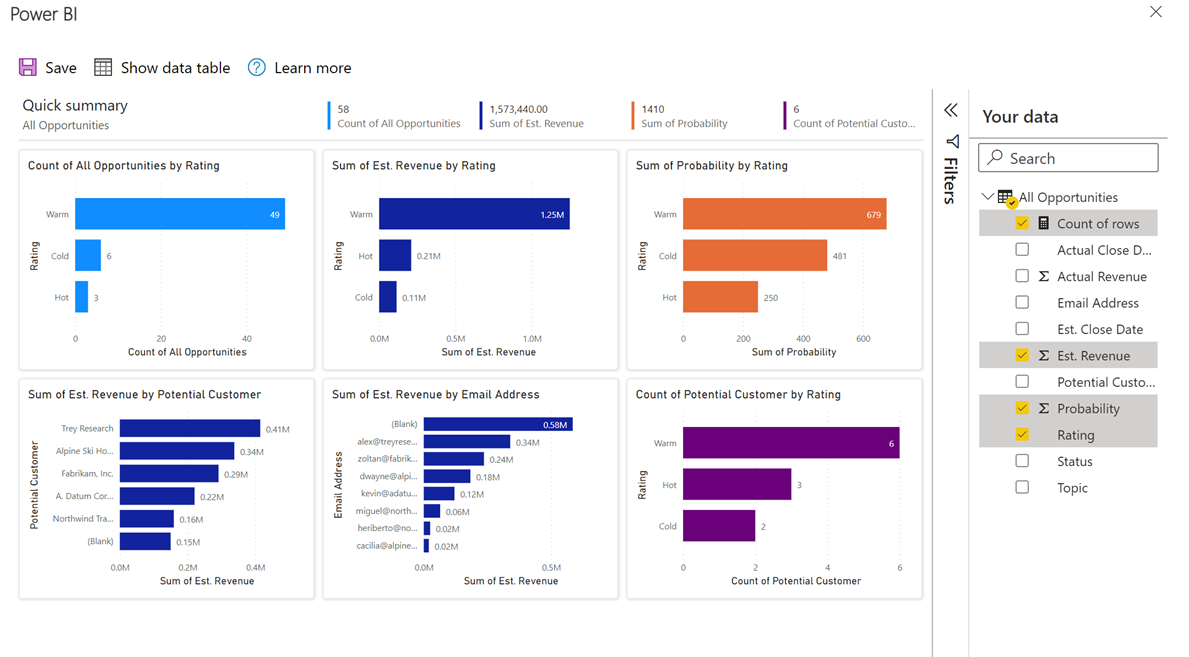
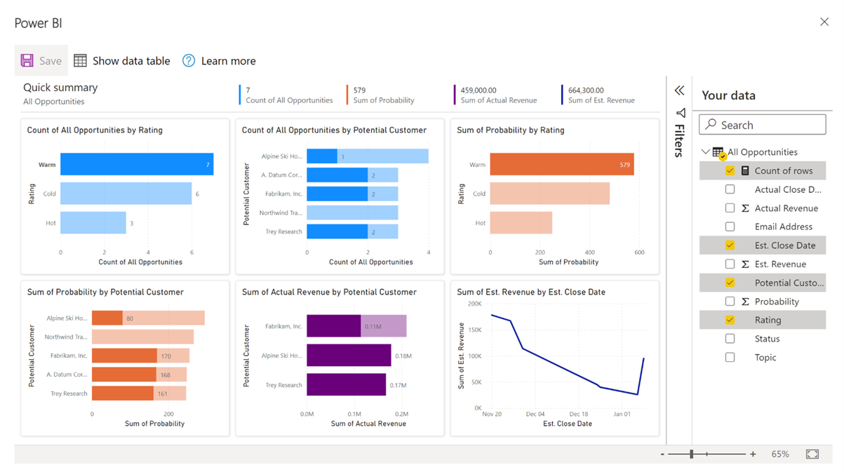
When we use this new feature, it takes about a minute to prepare a Power BI data model and then automatically creates a report containing multiple visualisations. In the background, the view from Dynamics 365 (or your own model-driven app ) is loaded as a Power BI dataset with several visualisations added as tiles to a single-page report. By default, a “Count of rows” measure appears so you can prepare charts relying on more than just the numeric fields in Microsoft Dataverse.
Select data columns of interest
When this process starts, a dialogue box prompts the user to select the data columns of interest for report building, as per the example on the right-hand side.
This selection guides the automated creation of charts and is of particular use when the data source has many columns. However, if we just leave the default values untouched, we find that Power BI can present useful default visualisations despite working on autopilot.
More variety with “Visualise this view”
At first glance, there are significant differences between the charts built-in to Dynamics 365/Model Driven Apps (“View as a Chart”) and this Power BI “Visualise this view” report. The “View as a chart” view uses a variation of these four types:
- Bar
- Column
- Pie
- Line
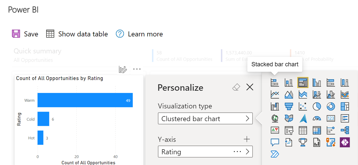
The “Visualise this view” feature offers many more variants that you can configure individually after the report is produced – see figure 4 below.
Figure 4 – Bar charts and beyond.
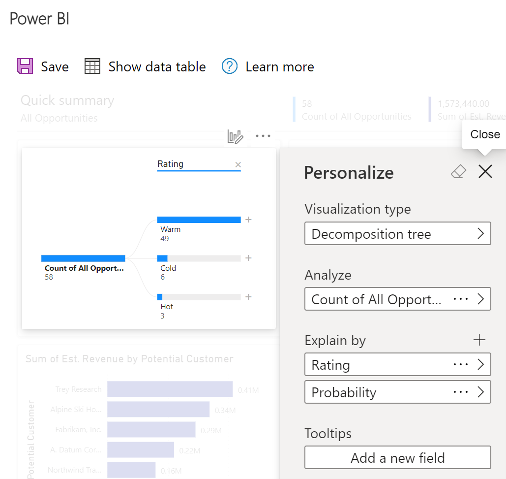
In addition, map visuals and the “Decomposition tree” chart type are examples of useful chart types you can use in Power BI and in Microsoft Excel but not with “View as a Chart,” as per figure 5 below:
Figure 5 – Decomposition tree charts use AI resources from the Azure cloud.
In terms of interactions with built-in charts, when you use the “View as a Chart” button you can:
- Use the selection in the chart to filter the records shown on the view
- Drill down from a single bar area to further details within the same table.
With the new “Visualise this view”, you can also apply filters:
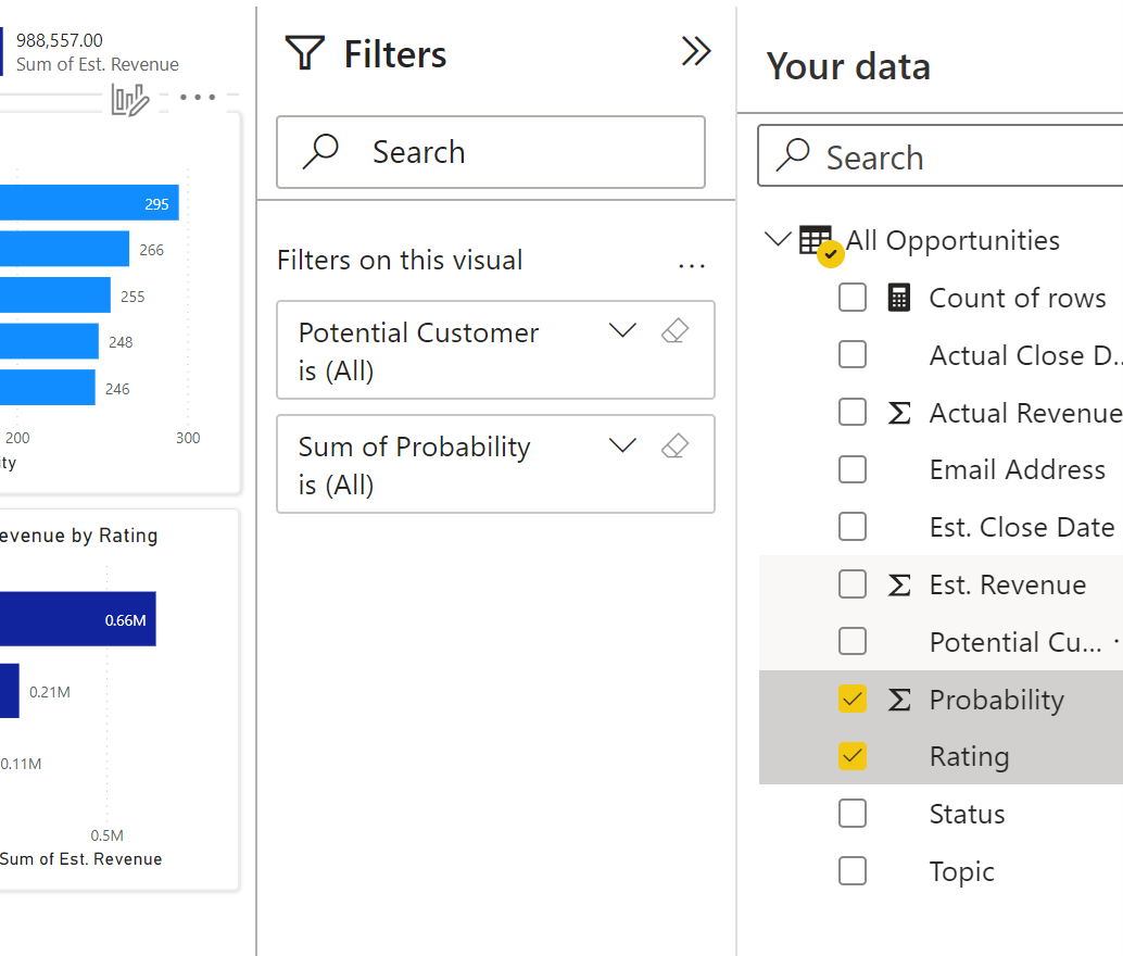
Figure 6 – A filter pane appears with the fields selected for our chart.
You can also cross-highlight data across multiple charts. These two methods help with data discovery and assist presentation preparations, as shown below.
Figure 7 – A rating of “Warm” was selected on the top left chart, thus impacting all other charts.
Exporting data
In terms of data export, the built-in charts allow users to save the data from the view as an Excel file, while the chart itself does not offer a facility to save the image file.
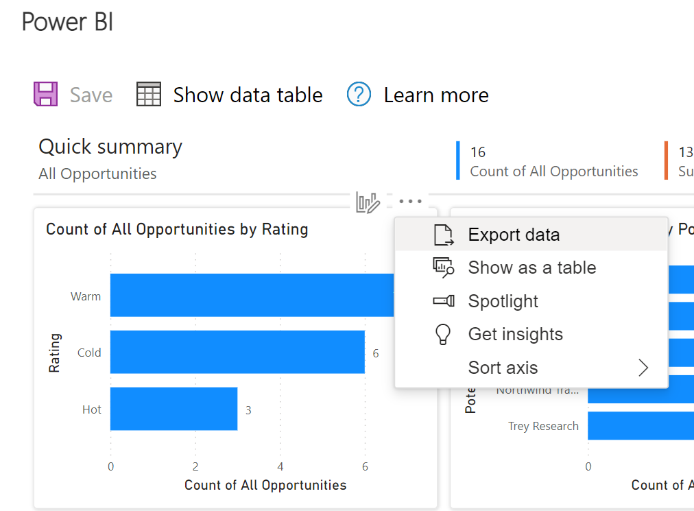
The “Visualise this view” report does not allow exporting data from the underlying dataset directly from the user interface. However, we can see that the context menu for each chart suggests that this will be possible in the future (see figure 8). With a Power BI Pro (or Premium) license the collaboration features are significantly enhanced. A licensed user can save the “Visualise this view” report to a Power BI workspace and continue their analysis work there.
Figure 8 – The “Export Data” menu is in place but not working yet.
When we save the report to a Power BI workspace, we can see two new assets saved: a Power BI Dataset and a Power BI Report. The report can be saved as a new PBIX file which retains the usual functionality from Power BI. Crucially, the report sourced from a single view of data from Dynamics/Power Apps can be expanded with multiple data sources, shared with others, embedded in Microsoft PowerPoint and websites, added to a dashboard with many other reports, and much more.
At the time of writing, the data model is set by Microsoft to expire after one hour. When the original view is replaced or its filters change, the process of generating a new report quickens compared to the initial report creation. Some of the options offered in the context menu of each chart are reserved for users holding a Power BI Pro (or Premium) license. The ability to save the report to a Power BI workspace is equally reserved for paid subscribers and enables the full suite of configuration, customisation and sharing of the new Power BI report.
Visualise your organisation using Power BI
At a time when new use cases for AI make news headlines every day, the appearance of automated report creation in Excel and model-driven apps is very exciting. The “Visualise this view” feature offers a very practical way to create a new Power BI report with automated data preparation, with a set of useful default charts in place of a blank canvas. Given Power BI receives monthly updates, this is a very promising start to the implementation of emerging features. If you would like to find out more about Microsoft’s latest releases get in touch today.

